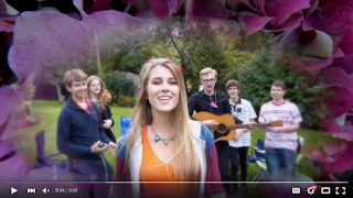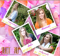

An initial way that we intended to create synergy between our products (music video and digipak) was that we used the same image of flowers used in the vignette mask in the music video whilst also using this as the background of most pages of the digipak. Our early thoughts for the digipak was; to have a colourful background or an image for the background although, we also wanted a background that would make the text standout as it is a vital tool for engagement with the audience. Using Adobe Photoshop we split up the existing floral image and separated certain flowers that looked particularly bright and clear, we then created a repeating pattern. Another aspect of the background was, our intention to adhere to the convention of vibrant explosive colours to ultimately appeal to our target audience. Due to the nature of our chosen song we chose to use stereotypically feminine colours- the most recurring colours include orange and pink which were filtered throughout the music video. Further driving our easily identifiable synergetic compound of products.
 Colours of texts we used was something else we considered when constructing our products especially our digipak and our music magazine advert. Using the colour wand tool


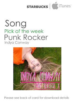
I also created synergy with our stars clothing (Indya), during the music video Indya was shown wearing a bright orange t-shirt, I then used this colour as within the magazine advert and the digipak. The orange used was due to the fact it is vibrant and has positive denotations for our star image- it has upbeat and happy connotations that can be linked with the music video.
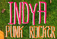
Synergy was also used within the music video and the digipak when using the same text style on the credits as we did on the disk, both these details are very small about our overall product branding but a very active audience member could identify these are the same. In retrospect I feel that this attention to the small detail ultimately constructs a more professional product. I also think that the use of this easily readable font is very good for opening up our target audience to a vast majority of people.
In our products we also made sure to illustrate Indya wearing a variety of clothing used across the entire video, this essentially displayed Indya's entire star image. The clothing Indya used was all her own cothing as it expressed a very authentic and naturalistic star image. We also used casual clothing because it meant that Indya's potential fans could easily emulate her bright and casual clothing style. Due to the fact it is easy to replicate these clothes.
 Across all of our products, I chose to use similar fonts, within the music video our font for the title of the song was handwritten. So we searched for a font that looked similar. So we went on onto 1001 free fonts. The font then became the main font used across all of the products.
 In our media products we intended to create synergy across all of our brand and promote our artist at the same time. This is the reason that we put tour dates on our digipak for both our music magazine advert and the digipak. Even though the fonts do not match, we chose to use instructional detail and the tour dates that was on the digipak had to be matched onto the advertisement- this made it seem more authentic and professional.
Our main use of synergy was the association of images, we used the same image for the album cover as the magazine advertisement. Both images were kept fairly lain as this meets moder conventions. The same image was used as it denoted the artist in a fun and creative light, whilst also creating a simple link between the artist and the digipak.
Additional promtional media
Even when creating additional media products that were not in the brief, we intended to keep the synergy between our products. Even though it was not apart of the brief, we felt that this really emphasised our brand image. I wanted to create a promotional piece that could appeal our major target audience, this is due to our audience being mainly teenagers.


No comments:
Post a Comment