This is my Ramones inspired mood board, I chose to make this one more rock and roll however with some unconventional features, such as the rainbow jukebox and the red acoustic guitar- to make the music video potentially more quirky and unique, however, I also kept more traditional features such as the electric guitars- as this is as the song is stereotypically an Indie/rock style song.
Monday, 31 August 2015
Research: The ramones- Teenage lobotomy Mood board
This is my Ramones inspired mood board, I chose to make this one more rock and roll however with some unconventional features, such as the rainbow jukebox and the red acoustic guitar- to make the music video potentially more quirky and unique, however, I also kept more traditional features such as the electric guitars- as this is as the song is stereotypically an Indie/rock style song.
Sunday, 30 August 2015
Research: Saint Raymond- Everything she wants Mood board
This is my Indie inspired Polyvore, basing my ideas around a potential music video for the song- Everything she wants, Saint Raymond. I feel that I would like to use a mixture of both Indie and Punk- to combine the two,
whilst keeping the background of the music video fairly plain and
natural- like a field or a seafront as I feel that it would complement the indie look. This would be shown with the contrasting of colours throughout the video.
Wednesday, 26 August 2015
Research: Overall Indie Genre- Mood board
 For my mood board I used inspiration from the indie/rock music genre,
including music they may listen to, clothing brands and other things
that may represent the lifestyle of someone who listens to indie/rock
music. The bands I used on my mood board include Bastille, The 1975 and
The Kooks, all of which are bands that I have studied within my genre
analysis’. They are all indie/rock hybrids, and are also relatively
mainstream thus meaning that most indie/rock fans will have heard
of/listened to them. This also means that both indie fans and rock fans
will have heard of them, meaning that my demographic is wider. I used
two images taken from live performances of the bands, as I know that
most indie/rock fans will have seen these bands live in concert.
Additionally, I used the Reading/Leeds festival logo as this is a
well-known festival for fans of the indie/rock genre.
For my mood board I used inspiration from the indie/rock music genre,
including music they may listen to, clothing brands and other things
that may represent the lifestyle of someone who listens to indie/rock
music. The bands I used on my mood board include Bastille, The 1975 and
The Kooks, all of which are bands that I have studied within my genre
analysis’. They are all indie/rock hybrids, and are also relatively
mainstream thus meaning that most indie/rock fans will have heard
of/listened to them. This also means that both indie fans and rock fans
will have heard of them, meaning that my demographic is wider. I used
two images taken from live performances of the bands, as I know that
most indie/rock fans will have seen these bands live in concert.
Additionally, I used the Reading/Leeds festival logo as this is a
well-known festival for fans of the indie/rock genre.Furthermore, I have used clothing brands such as ‘Drop Dead Clothing’, ‘Cheap Monday’ and ‘Urban Outfitters’ which are all common clothing brands within the indie/rock genre..
Tuesday, 25 August 2015
Research: Independent Record label logos analysis
4AD
This logo has an extremely elegant look, with a striking symmetrical design. Each of the initials inside squares in block capitals and the font style used makes the logo look vintage.
Fool's Gold
Stones Throw Records
I love the overall feel to this logo due to the nostalgic ambiance it creates, the black and white scheme is authoritative and powerful; because black can evoke strong
emotions, too much can be overwhelming. Black represents a lack of
color, the primordial void, emptiness. It is a classic color for
clothing, possibly because it makes the wearer appear thinner and more
sophisticated. The text within the logo is very clever in the way it appears to break the wall of the circular background which really makes this logo "pop".
K
This independent record label logo is just about as simple as it gets with it's childish like approach, at first glance i thought this looked very unprofessional and unappealing because of its lack of authority. But at second glance I believe I somewhat understood what the companies intentions was; the idea that music can come in all different styles and appearances, in which case music does not need to be taken so seriously.
Matador
 This logo has connotations of Spain and bull fighting- connoting quite
an exotic feel. This logo also features colour, with a purple gradient,
it gives the impression of depth and makes the logo appear 3D- like the
cloth used in a bull fighting arena, however, you would therefore expect
the font to be in red, but the purples connote a more cool and tranquil
feel, it makes the music label appear more relaxed and timeless. This
logo is also fairly simple, which makes it easy to reproduce in
advertising.
This logo has connotations of Spain and bull fighting- connoting quite
an exotic feel. This logo also features colour, with a purple gradient,
it gives the impression of depth and makes the logo appear 3D- like the
cloth used in a bull fighting arena, however, you would therefore expect
the font to be in red, but the purples connote a more cool and tranquil
feel, it makes the music label appear more relaxed and timeless. This
logo is also fairly simple, which makes it easy to reproduce in
advertising.Friday, 21 August 2015
Editing conventions within music videos
Conventions
- Jump cuts
- Extreme shots
- Steady camera shots
- Establishing shots
- Diegetic sound
- Handheld camera shots
- Continuous use of continuity editing
Tuesday, 18 August 2015
Research Music Video analysis
Nobody's perfect - Jessie J
This music video mixes up the tenses and shows intuition within editing
and camera usage. Apart from the pyrotechnics and amazing use of props
and green screen, the music video tells a story within the mixed up
montage of clips representing different doors within her mind. I like
this video as the messed up montage of clips and extreme editing
techniques tell a story, even though it isn't chronological.
Islands - The XX
*NEED TO LEARN TO EMBED SONGS*
Sunday, 16 August 2015
Research Media Music Videos: Original song ideas
 The 1975 - Heart Out
 Genre- again Indie, English song, free - flowing lyrics that could easily be portrayed within a music video. Also allows us to create a star image for our actor as the lyrics relate to Indie culture.
Pros:
- the change of beat of the song can create good opportunities for editing and different techniques.
- the lyrics used are very indie and quirky and therefore random clips can relate to the words sung, whilst keeping a narrative throughout.
- repetition of certain beats and the chorus also gives a great opportunity for editing techniques, but also for lip syncing
Cons:
-could be too 'random' to have a stable narrative story throughout, could have too much of a cliche narrative
-maybe to repetitive which could bore the audience
-male vocal, which could cause a problem by having to either find a male participant willing to lip sync, or to try and make the 'lip sync-er' androgynous.
Research Media Music Video: Original song ideas
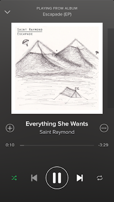
Saint Raymond - Everything She Wants
The genre- Indie, simplistic lyrics which gives a base structure to the potential music video. I also believe this Indie track has a very open feel to the song, which allows room for developing a star image for our actor. This is the reason of an effortless look which will enrapture our conventional Indie target audience. The vision for this song would be a montage of clips which would be random yet link to create a narrative, possibly a love story between a young couple, and however close they get they still push each other away.
Pros:
-steady beat for narrative
-very indie allowing a montage of 'random' clips
- steady beat allowing for good editing in time, showing professionalism
-girl singing so there would be no trouble in looking for an actress
-links between the clips and the lyrics would be easy to create
Cons:
-negative connotations within the lyrics which could be hard to make the audience 'feel' the song.
-the beat doesn't change as much as the song above, so any changes would not be as shocking, which the song is quite powerful and could possibly need the shock factor to make an impact.
Thursday, 13 August 2015
Final Cut Pro X
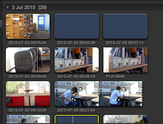
Within Final Cut Pro X, we began to create a sixth form video, hence we filmed short clips around sixth form in varying locations, we filmed outside, in the dining area, on the stairs on the way up to the media and English block, the work room in sixth form, the pigeon hole area in sixth form and the common room. We also tried to take varying shots ranging from close ups, to extreme close ups, to wide angle shots. We then had to work out which shots where the best ones, and the ones we then wanted to use in our sixth form video.
We then found transitions section of Final Cut Pro , however, the majority of the transitions that we wanted to use were cuts, this is because simple cuts are a convention of most music videos. However, we did try to break convention in some areas, hence the use of a fade between a shot we took of the work room and the common room this is as it appeared to create a match cut. I feel that I would like to experiment more with different cuts in the lead up to my music video to work out which ones are the most effective. Although I like the different transitions within the section, I feel that the majority break convention to much, such as the swing and the swap- and therefore wouldn't appear to match up in the music video that we would want to make look professional.
We also went on to add intro credits to the video, we used the phrase "Sixth Form AS/A2 education" and put them on in different places and sizes in order to make the clip more visually interesting, it also added movement to what was a static clip of the pigeon holes at sixth form. However, we did begin to notice that we had a smudge on our camera lens in the top left corner when we started filming.
We also added in a clip to the beginning of the video that we found whilst experimenting with Final Cut ProX of an ink blob which rushed around the screen, it helped to make the introduction of the song "Bright Eyes- best day of my life" more interesting as there obviously wasn't any lyrics in the introduction. We also added in the life at Brigg Sixth Form text which we managed to cut on the beat.
Within these two shots, a wide shot of Patrick and an extreme close up of Patrick playing cards, we managed to create continuity editing, we also used these two shots as they were fairly natural and weren't staged, it made the whole video appear more relaxed. We also continued with the Sixth Form text for the continuity editing as well as the music which created a sound bridge between the two shots within the music video.
To achieve continuity editing, we bladed the clip of Patrick, just as he put his hand on the table t put a card down, we then added in the zoom in of the card shot and bladed that to focus on Patricks hand on the beginning, in order to make the transition between the two clips seem seamless. We also used the video clip of Patrick with the playing cards in the background of our vignette shot in order to add another dimension.
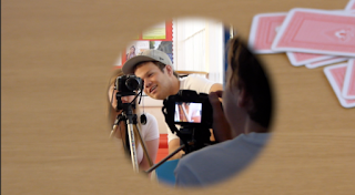
 We also went on to play around with different vignettes and putting
images in the background, here we used a over the shoulder shot of us
filming the music videos, and then placed an extreme close up of Patrick
playing cards in the background, although I liked the effect this had, I
felt that it made it appear to busy and you couldn't find a focal point
within the video to focus on.
 Within Final Cut Pro X, we had a play around with speed and reversing in order to make the video more unusual and different.
This is our selection of clips we used in order to crate this simplistic short film.
Monday, 10 August 2015
Subscribe to:
Comments (Atom)


