Saturday, 26 September 2015

Group: Indie record label design ideas


luke seddon's Slidely Gallery by Slidely Photo Gallery

Planning: Indie Record Label Designs


These Indie Record Labels were created on PhotoShop Elements 11- We are going to do a questionnaire to work out which logo people prefer. This will give me and Emily a demographic of what our potential target audience would like. We are also aiming for the most authentic looking company for our Indie pop style genre. From this we will understand what our target audience feels the most authentic.


Planning: Draft script of the music video

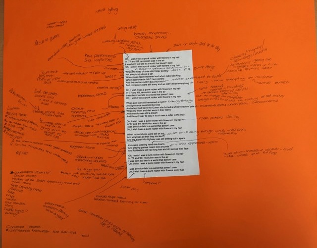
Scene 1: Indya walking along a street, someone in a hoodie knocks her, her headphone falls out, she puts her headphone back in and the music starts.
Scene 2. Indya walks whilst performing into camera, use of varying shots in order to create more attitude, wearing fairly modern and simple clothing.
Scene 3: Modern Scenario- dark lighting and dark clothing for everyone except Indya
Scene 4: Close up of someone playing a guitar- hands on strings
Scene 5: POV shot from a bike looking onto a rusty looking bike, filmed on a public footpath in older clothing.
Scene 6: Indya and 7 other sat round a radio- interacting listening to music, possibly another person sat in dark, modern clothing listening to music through their headphones.
Scene 7: Robbie dressed as an accountant getting out of a fancy car and acting like he’s on the phone to someone, as he puts the phone down to end the call, the word media is written across the screen
.
Scene 8: Indya sat at one of the Mac’s typing I know everything on the screen.
Scene 9: Indya walking along listening to music, her costume begins to change- for instance, this time the flowers began to appear in her hair and she’s wearing eye liner.
Scene 10: Modern Scenario- everyone wearing dark clothing- except Indya, who is wearing the adjusted outfit.
Scene 11: Everyone sat round tents in the garden, having fun- dancing and interacting- no phones, they’re ignorance and don’t give a care about the world around them.
Scene 12: Indya singing into camera down a side street in Brigg, with a British flag around her (holding it)
Scene 13: Indya finds an old photograph, as the old photograph is zoomed into, the picture turns to like- could either be focused on one couple surrounded by others having a good time
Scene 14: Close up of someone posting a letter
Scene 15: Indya performing into camera, flowers appear behind her, more vibrant- costume alters again, this time she changes to a darker t-shirt and black jeans- or a bright t-shirt.
Scene 16: Indya flicking through vinyls in an old cardboard box- as if she’s just found them.
Scene 17: Time lapse stood at the motor way bridge of both the cars and the clouds
Scene 18: Shot of two people wearing oversized t-shirts that are a bit muddy- either freeze frame or having a kick about?
Scene 19: Football match- POV shot of the ball going over the match using a tiny camera- pans round to the crowd cheering
Scene 20: Performance shot again- of Indya- this time with everybody stood behind her having a good time, then flicks to everyone wearing hoodies in the background and back again, this time Indya’s costume is fully changed- could have a leather jacket and a chunky necklace
Scene 21: Final shot slowed down of Indya singing as balloons are released behind here- possibly red, white and blue balloons to match the flag, and a couple of black balloons to focus in on in the end- represents the idea of her being an individual.

Friday, 25 September 2015

Research- Target audience feedback


In order to gain target audience feedback, Emily has put our design ideas on Facebook asking for opinions. We discussed this and decided that Emilys Facebook was more suitable as she has a mix of both male and female friends.

Research: Indie Music video analysis of framing and angles- Ed Sheeran - Bloodstream

Ed Sheeran- Bloodstream


Opening shot
This first shot is at an obtuse angle (very high angle) with the protagonist in centre frame. He is in the pool, an active audience would question this start.


This second shot is an extreme long shot used to illustrate the mise en scene of the mansion. He is shown centre right of the frame.

This shot shows him again in centre frame this reinforces the idea of him being isolated from the world.

This shot is a slightly low angle shot of the man singing on a microphone again in centre frame, possible attempting to recreate his past.

Again centre frame, this time in a long shot, with the man with a gun. This could connote him attempting make himself feel more powerful.

Here he is agin in centre frame in an extreme long shot, this shot is very similar to the second shot; it further points at the fact he is alone, even in this luxurious mansion.

This medium shot we see him slightly to the right of the frame. He is throwing items of his past into the fire.


This shot is a low angle shot of the man looking out from his mansion, possibly seeing if anyone is watching. This angle addresses the power this man possesses.


This shot is a very low angle of the man jumping off the mansion, I believe he is doing this because he is trying to convince himself that his life is still worth living. In this shot he is still in centre which shows that he is the focal point of video.
This medium long shot is a slightly high angle shot with the man crying into his hands (denoting his venerability)- this is the reason of his life falling apart. He is shown in the left of frame which could connote how he isn't in control anymore.
This is the final shot of the music video where he is again alone in the mansion, which emphasises the fact that he doesn't feel wanted by the world anymore. The angle is neutral and he is in the middle to left of frame .


Thoughts
Many of the shots used are very dark but then in complete contrast they are extremely bright, this is used to establish emotions through visuals so the audience can easily understand what is happening.

How this has influenced my creativity and planning?
This music video has influenced my creativity and planning because it appears very niche/unique, with connotations of fame and how it can affect an artist. This would be in flip contrast to our star though, as she would be at the peak of her career. The types of shots used with the low angles to establish power could easily be implemented into our music video.


Tuesday, 22 September 2015

Group: Planning; Finding a location- bowling green and garden


luke seddon's Slidely Gallery by Slidely Photo Gallery


Thoughts
The lighting for the venue appears very high key- which is completely what we are after, the low key lighting areas such as the brick walk-through would be particularly useful for illustrating our star singing certain lines that have deeper denotations.

This has also influenced me to attempt some more creative shots with the use of "out of focus" shots with some leaves.

Monday, 14 September 2015

Research: Indie record labels- designs


Indie record label designs

These indie record label designs

Research: Record label ideas and designs


Space
This record label has a precise simplified look that is visually pleasing because of this layout. I really like the font of the text used it is bold and recognisable.  The only negative i have for this design is that i could be deemed over-simple.


The lab
In conjecture to "space" this record label design idea is complex and innovative- the test tube like design illustrates/signifies the wording of the record label. I like this idea of a message being illustrated through a design.


PM
This label by far is the most simplistic, it just has block letters "P" and "M". The exterior design could be interpreted as childish and that is  look we are not looking for. Overall I just feel that this is just too generic and doesn't break the boundaries.


Thought collection
I believe these designs give me an indication of the potential company names. All of these designs have different connotations for each. I believe "space" represents indie music, this is the reason of it being very simple and aesthetically pleasing.

Friday, 11 September 2015

Research: Carol Vernallis- Music video theorist

Thoughts on uses and gratifications theory - Blumler and Katz


Gratifications theory- influences

In terms of audience theories; I believe our music video will have an action point of "Personal identity" the personal identity will come from the progressive evolving of our star- the main lyric that drove this was "I wish i was a punk rocker with flowers in my hair". This would incorporate the: The reinforcement for personal values, finding models of behaviour, identifying with celebrities, gaining insight to ones self.


Thursday, 10 September 2015

Planning- Finding our star

Within our music video, our friend Indya has said that she will sing, we think that she is a great choice for our music video- given her bubbly, fun and confident personality.

Wednesday, 9 September 2015

Research: How have music videos change over time


Over the decades, all aspects of media have changed and evolved depending on current trends, interests and what’s popular and enticing for the audience. Often an overlooked type of media is music videos; this is perhaps due to technology such as iPods etc which simply just allows consumers to listen to music on the move, when they want rather than sitting down and flicking through music channels. When comparing music videos from past to present there are significant differences and it shows just how much they have evolved over the last 20-30 years or so, up to the most recent/famous of videos such as Gangnam style. Thanks to websites like Youtube the world has easy access to music videos and this has allowed me to look at some and gain ideas for my own.

Monday, 7 September 2015

Research: Textual analysis Pink- So what

Planning: Trying to gain permission from Sony Music Licensing


This is our email that we sent to Sony music licensing to gain permission for the song, Emily used her information for the email and our teacher outlined our intentions in the message box. If it is granted then we will be able to use the song for our music video.

Sandi Thom- Punk rocker Lyrics

Oh I wish I was a punk rocker with flowers in my hair
In '77 and '69 revolution was in the air
I was born too late, into a world that doesn't care
Oh I wish I was a punk rocker with flowers in my hair

When the head of state didn't play guitar
Not everybody drove a car
When music really mattered and when radio was king
When accountants didn't have control
And the media couldn't buy your soul
When computers were still scary and we didn't know everything

Oh I wish I was a punk rocker with flowers in my hair
In '77 and '69 revolution was in the air
I was born too late, into a world that doesn't care
Oh I wish I was a punk rocker with flowers in my hair

When popstars still remained a myth
And ignorance could still be bliss
And when God Saved the Queen she turned a whiter shade of pale
My mum and dad were in their teens
And anarchy was still a dream
And the only way to stay in touch was a letter in the mail

Oh I wish I was a punk rocker with flowers in my hair
In '77 and '69 revolution was in the air
I was born too late, into a world that doesn't care
Oh I wish I was a punk rocker with flowers in my hair

When record shops were still on top
And vinyl was all that they stocked
And the super info highway was still drifting out in space
Kids were wearing hand me downs
And playing games meant kick arounds
And footballers still had long hair and dirt across their face

Oh I wish I was a punk rocker with flowers in my hair
In '77 and '69 revolution was in the air
I was born too late, into a world that doesn't care
Oh I wish I was a punk rocker with flowers in my hair

I was born too late to a world that doesn't care
Oh I wish I was a punk rocker with flowers in my hair

Friday, 4 September 2015

Development of ideas and Song choice

Today me and Emily discussed song choices and she won me over with Sandi Thom Punk rocker. The song itself would be listed under Indie pop, which means i will have to further my understanding of Indie pop. Of which will include; clothing, colour schemes and codes and conventions.

Tuesday, 1 September 2015

Research: Arctic Monkeys- One for the road Mood board

Here is my arctic monkeys inspired mood board; it has a simplistic city feel to it, within this song, the lyrics are quite slow and its based of an older song, so with in this music video I decided to combine both 80's style clothing with modern indie clothing- this is because I felt that together, they both had good synergy.

Monday, 31 August 2015

Research: The ramones- Teenage lobotomy Mood board


This is my Ramones inspired mood board, I chose to make this one more rock and roll however with some unconventional features, such as the rainbow jukebox and the red acoustic guitar- to make the music video potentially more quirky and unique, however, I also kept more traditional features such as the electric guitars- as this is as the song is stereotypically an Indie/rock style song.

Sunday, 30 August 2015

Research: Music Video Genre Analysis- Theorists, theories

Research: Saint Raymond- Everything she wants Mood board

This is my Indie inspired Polyvore, basing my ideas around a potential music video for the song- Everything she wants, Saint Raymond. I feel that I would like to use a mixture of both Indie and Punk- to combine the two, whilst keeping the background of the music video fairly plain and natural- like a field or a seafront as I feel that it would complement the indie look. This would be shown with the contrasting of colours throughout the video. 

Wednesday, 26 August 2015

Research: Overall Indie Genre- Mood board


Mood Board PicFor my mood board I used inspiration from the indie/rock music genre, including music they may listen to, clothing brands and other things that may represent the lifestyle of someone who listens to indie/rock music. The bands I used on my mood board include Bastille, The 1975 and The Kooks, all of which are bands that I have studied within my genre analysis’. They are all indie/rock hybrids, and are also relatively mainstream thus meaning that most indie/rock fans will have heard of/listened to them. This also means that both indie fans and rock fans will have heard of them, meaning that my demographic is wider. I used two images taken from live performances of the bands, as I know that most indie/rock fans will have seen these bands live in concert. Additionally, I used the Reading/Leeds festival logo as this is a well-known festival for fans of the indie/rock genre.
Furthermore, I have used clothing brands such as ‘Drop Dead Clothing’, ‘Cheap Monday’ and ‘Urban Outfitters’ which are all common clothing brands within the indie/rock genre..

Tuesday, 25 August 2015

Research: Independent Record label logos analysis


 - 4AD Records
4AD
This logo has an extremely elegant look, with a striking symmetrical design. Each of the initials inside squares in block capitals and the font style used makes the logo look vintage. 


 Fool's Gold
This logo is more unusual as it is more graphic based, however, in this logo, I really like the yellow on black as it is unusual but its still really effective at grabbing the audience. Within this logo, the text and the image are synergous and work together, the dimensions of the image also make it appear 3D as if the logo is set back in the computer screen, making it stand out and providing a sense of movement within the image. I really like the look of this logo mainly because of the 3D effect it gives.


 Stones Throw Records
I love the overall feel to this logo due to the nostalgic ambiance it creates, the black and white scheme is authoritative and powerful; because black can evoke strong emotions, too much can be overwhelming. Black represents a lack of color, the primordial void, emptiness. It is a classic color for clothing, possibly because it makes the wearer appear thinner and more sophisticated. The text within the logo is very clever in the way it appears to break the wall of the circular background  which really makes this logo "pop".


K - K
K
This independent record label logo is just about as simple as it gets with it's childish like approach, at first glance i thought this looked very unprofessional and unappealing because of its lack of authority. But at second glance I believe I somewhat understood what the companies intentions was; the idea that music can come in all different styles and appearances, in which case music does not need to be taken so seriously.


Matador
This logo has connotations of Spain and bull fighting- connoting quite an exotic feel. This logo also features colour, with a purple gradient, it gives the impression of depth and makes the logo appear 3D- like the cloth used in a bull fighting arena, however, you would therefore expect the font to be in red, but the purples connote a more cool and tranquil feel, it makes the music label appear more relaxed and timeless. This logo is also fairly simple, which makes it easy to reproduce in advertising.


Friday, 21 August 2015

Editing conventions within music videos

Conventions 

  • Jump cuts 
  • Extreme shots 
  • Steady camera shots 
  • Establishing shots 
Broken conventions 

  • Diegetic sound 
  • Handheld camera shots 
  • Continuous use of continuity editing  

Tuesday, 18 August 2015

Research Music Video analysis


Nobody's perfect - Jessie J 


This music video mixes up the tenses and shows intuition within editing and camera usage. Apart from the pyrotechnics and amazing use of props and green screen, the music video tells a story within the mixed up montage of clips representing different doors within her mind. I like this video as the messed up montage of clips and extreme editing techniques tell a story, even though it isn't chronological.

Islands - The XX

This music video is purely amazing just on one very simple term. With repetition of mid-length clips, all seems to be the same yet whilst repeating the shot what seems to be near exact, the members of the band lip-sync perfectly in time whilst the repetition of the dancers occurs around them. The members of the band move within the chaos of the dancers and nearing the end of the video, a dancer is missing yet all seems to carry on until the destruction at the end. I like this video due to repetition and slight changes within the dancing to tell a story and to represent the lyrics of the song.

*NEED TO LEARN TO EMBED SONGS*

Sunday, 16 August 2015

Research Media Music Videos: Original song ideas

The 1975 - Heart Out

Genre- again Indie, English song, free - flowing lyrics that could easily be portrayed within a music video. Also allows us to create a star image for our actor as the lyrics relate to Indie culture.
 Pros:
- the change of beat of the song can create good opportunities for editing and different techniques.
- the lyrics used are very indie and quirky and therefore random clips can relate to the words sung, whilst keeping a narrative throughout.
- repetition of certain beats and the chorus also gives a great opportunity for editing techniques, but also for lip syncing

Cons:
-could be too 'random' to have a stable narrative story throughout, could have too much of a cliche narrative
-maybe to repetitive which could bore the audience
-male vocal, which could cause a problem by having to either find a male participant willing to lip sync, or to try and make the 'lip sync-er' androgynous.

Research Media Music Video: Original song ideas

Saint Raymond - Everything She Wants

The genre- Indie, simplistic lyrics which gives a base structure to the potential music video. I also believe this Indie track has a very open feel to the song, which allows room for developing a star image for our actor. This is the reason of an effortless look which will enrapture our conventional Indie target audience. The vision for this song would be a montage of clips which would be random yet link to create a narrative, possibly a love story between a young couple, and however close they get they still push each other away.

Pros:
-steady beat for narrative
-very indie allowing a montage of 'random' clips
- steady beat allowing for good editing in time, showing professionalism
-girl singing so there would be no trouble in looking for an actress
-links between the clips and the lyrics would be easy to create
   
Cons:
-negative connotations within the lyrics which could be hard to make the audience 'feel' the song.
-the beat doesn't change as much as the song above, so any changes would not be as shocking, which the song is quite powerful and could possibly need the shock factor to make an impact.


Thursday, 13 August 2015

Final Cut Pro X

 First Attempts at Using Final Cut Pro X
Within Final Cut Pro X, we began to create a sixth form video, hence we filmed short clips around sixth form in varying locations, we filmed outside, in the dining area, on the stairs on the way up to the media and English block, the work room in sixth form, the pigeon hole area in sixth form and the common room. We also tried to take varying shots ranging from close ups, to extreme close ups, to wide angle shots. We then had to work out which shots where the best ones, and the ones we then wanted to use in our sixth form video.
We then found transitions section of Final Cut Pro , however, the majority of the transitions that we wanted to use were cuts, this is because simple cuts are a convention of most music videos. However, we did try to break convention in some areas, hence the use of a fade between a shot we took of the work room and the common room this is as it appeared to create a match cut. I feel that I would like to experiment more with different cuts in the lead up to my music video to work out which ones are the most effective. Although I like the different transitions within the section, I feel that the majority break convention to much, such as the swing and the swap- and therefore wouldn't appear to match up in the music video that we would want to make look professional.

We also went on to add intro credits to the video, we used the phrase "Sixth Form AS/A2 education" and put them on in different places and sizes in order to make the clip more visually interesting, it also added movement to what was a static clip of the pigeon holes at sixth form. However, we did begin to notice that we had a smudge on our camera lens in the top left corner when we started filming.
We also added in a clip to the beginning of the video that we found whilst experimenting with Final Cut ProX of an ink blob which rushed around the screen, it helped to make the introduction of the song "Bright Eyes- best day of my life" more interesting as there obviously wasn't any lyrics in the introduction. We also added in the life at Brigg Sixth Form text which we managed to cut on the beat.
Within these two shots, a wide shot of Patrick and an extreme close up of Patrick playing cards, we managed to create continuity editing, we also used these two shots as they were fairly natural and weren't staged, it made the whole video appear more relaxed. We also continued with the Sixth Form text for the continuity editing as well as the music which created a sound bridge between the two shots within the music video.
To achieve continuity editing, we bladed the clip of Patrick, just as he put his hand on the table t put a card down, we then added in the zoom in of the card shot and bladed that to focus on Patricks hand on the beginning, in order to make the transition between the two clips seem seamless. We also used the video clip of Patrick with the playing cards in the background of our vignette shot in order to add another dimension.

 We also went on to play around with different vignettes and putting images in the background, here we used a over the shoulder shot of us filming the music videos, and then placed an extreme close up of Patrick playing cards in the background, although I liked the effect this had, I felt that it made it appear to busy and you couldn't find a focal point within the video to focus on.


Within Final Cut Pro X, we had a play around with speed and reversing in order to make the video more unusual and different.


This is our selection of clips we used in order to crate this simplistic short film.